Even with the current trend of gesture-based interfaces, every app needs a button here and there.
The UIKit class for buttons is called UIButton and it’s easy to customize with a background or an icon.
In fact, nearly all iOS apps use customized buttons instead of using the native look.
It’s not a surprise, given that the native style of UIButton, isn’t very appealing:
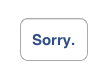
It probably doesn't look good with your design.
This post is not about UIButtons at all
Here’s UIToolbar. You probably already met.
Let’s build a subclass of UIToolbar with a transparent background. That’s easy with UIAppearance1:
@interface TransparentToolbar
@end

@implementation TransparentToolbar

+ (void) initialize
{
    [[self appearance] setBackgroundImage:[UIImage new] forToolbarPosition:UIToolbarPositionAny barMetrics:UIBarMetricsDefault];
    [[self appearance] setShadowImage:[UIImage new] forToolbarPosition:UIToolbarPositionAny];
}

@end
That’s all.
Now instantiate one TransparentToolbar, from a nib file or from code:
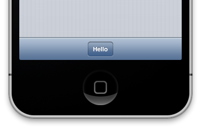
Tadaaa! Here’s a good-looking, 100% SDK, iOS button.
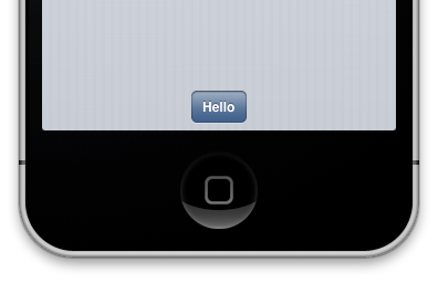
Let’s add some color2
Individual buttons in UIToolbars are UIBarButtonItems, and you can tune their color with tintColor.
Here is it in action: those two buttons were entirely designed in Interface Builder, with zero drawing code, and no image resources.
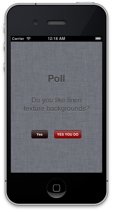
Great background texture, right? Seriously, the buttons look just right. Apple made them.
Well, there you have it. Basically for free, great-looking, native buttons for iOS, with adjustable tint.
But that’s a dirty hack!
That was @ndfred’s reaction to this idea. Indeed there are a few limitations to this method, but frankly, it’s not as bad as it seems.
Don’t use UIToolbar for UIButtons! That’s heavy/gross/wrong!
The biggest issue is that you end up with UIToolbars everywhere in your nibs instead of UIButtons. It’s not a problem per se, but since the toolbars are not transparent in Interface Builder, it adds some noise.
On the other hand, it prevents you from misaligning your buttons: it’s possible to misalign UIButtons, much harder with UIToolbar items.
It’s a hack!
It’s only using official APIs. As seen above, it’s exactly two lines of UIAppearance.
The Programmer Dilemma:
Do you want a two-liner hack that works, or a 200-lines “philosophically correct” solution ? Which one is easier to maintain?
OK, it’s not really using the API as Apple thought of it3, but I’m pretty sure it wouldn’t lead to a rejection.4 All the buttons in my app Bicyclette are actually made this way, and it’s been on the store for 6 months.
You can’t customize UIToolbars Buttom Items!
Well, that’s the point actually. Apple made those toolbar buttons with a decent look and a correct size.
Using standards is good in general. Only create something else if the standard doesn’t work for you.
In this case, you know UIToolbar buttons work for your users: they 1) look good and 2) don’t require your users to learn.
Couldn’t you use the underlying images in a UIButton instead?
UIBarButtonItem is not a subclass of UIView.
Of course, there’s a real UIView somewhere in the hierarchy, and a “drawRect” method responsible for drawing the gradients and the corners, but it’s really private stuff, internal to UIToolbar.
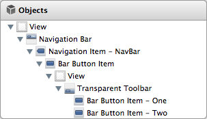
BONUS: UINavigationBar
Here’s another hack that can be achieved with a transparent toolbar.
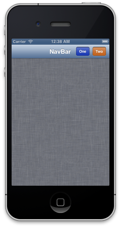
UINavigationBar, is UIToolbar’s cousin. It works very similarly, and uses two UIBarButtonItems, one on each side of the title. It’s theorically impossible to add more items.
The trick is that UIBarButtonItem can use a custom UIView as its contents, and we can just fit a transparent toolbar in there!
Take a look at this view hierarchy in Interface Builder:
Voilà! A clean-looking duo of buttons inside our UINavigationBar. Even with randomly-chosen colors, it doesn’t look completely ugly.
Into a view.
Into an BarButtonItem.
Into a NavigationItem.
Into a NavBar.
(Of course, on iPhone, there’s often no room for a second button. On iPad however, there’s plenty of space in the Navigation Bar.)
Conclusion
That’s it for today! Now you have exactly zero excuse to use Rounded Rect UIButtons, even if you have no designer in the team.
I added the test code for this post as a small github repo. Comments and suggestions are welcome, on Twitter or by email.
Edit, 2013-02-17: Added some thoughts on why it’s not such a bad idea as it seems.
-
Before
UIAppearance, we would have made the backgroundColor clear, and implemented an emptydrawRect:method. It’s easier now. ↩ -
A word of warning: I’m a developer. I may correspond to some definitions of a “designer”, but if I can stay away from Photoshop, it’s better for both of us. ↩
-
Did you ever write
[UIImage new]? ↩ -
Of course, you never know. This is the App Store Review Process. ↩