This is the blogpost version of a talk at Cocoaheads Paris in December 20151.
TL;DR: 17-second video at the end.
–
A few months ago, Captain Train opened a dataset of train stations in Europe. Here are the train stations in Paris:

Let’s zoom out to get a better view:
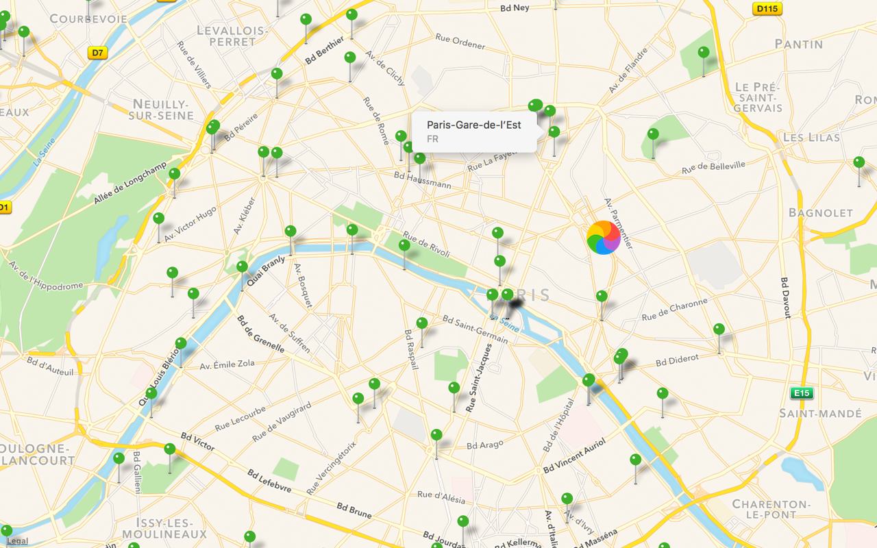 Whoops. The UI stalls for a dozen of seconds, which isn’t entirely a surprise: the whole csv is 23,000 POIs2.
Once we’re done waiting, this appears:
This is Very Bad™.
There are three probems here:
- Performance is abysmal, even on a powerful device.3
- It’s hard to use: with points so close to each other, it’s impossible to accurately pick one.
- There’s no information hierarchy: this looks like a forest. There’s no structure at all.
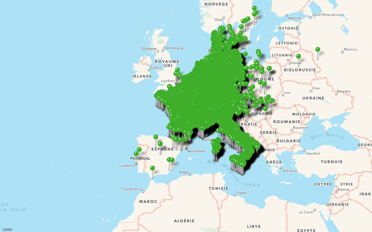
The usual solution to this problem is to group nearby POIs together, using a POI Clustering algorithm4:
Here we have grouped pins together, making sure there aren’t too many pins on the map. Performance is smooth again; and users can select each pin easily. Problem solved!
Except it’s not.
The cluster points do not exist in the real world.5 They are just flat, arbitrary groups: they don’t add structure to our map.
In fact, even with that noisy forest of pins, we could see that our dataset had way fewer stations in eastern Europe. Now everything looks the same everywhere. We’ve actually made things worse.
This is 💩
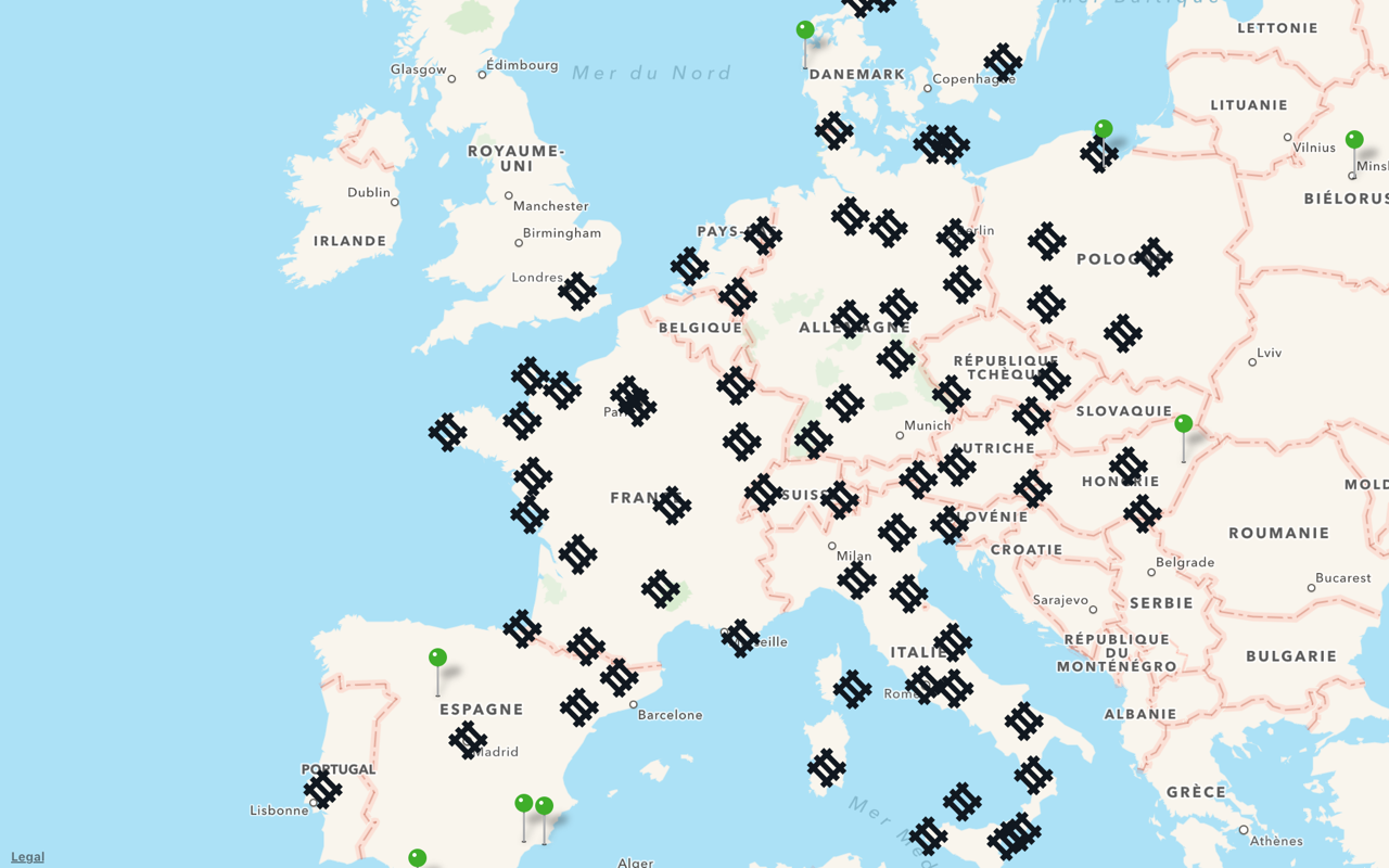
On top of that, most POI clustering algorithms introduce weird artifacts. For example, cluster groups tend to be aligned on a grid:
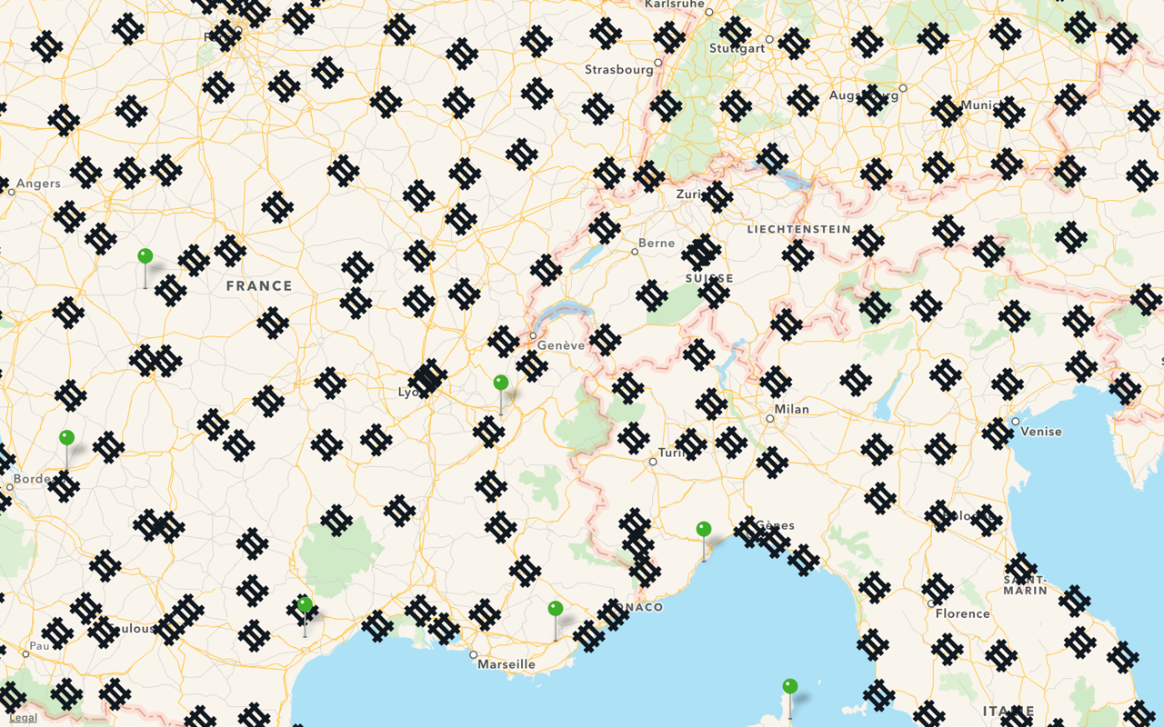
Again, this grid does not exist. Why does it appear on my map?
Let’s rethink this.
What are we trying to do exactly?
We’re showing the location of train stations on a map. But a train station isn’t just a latitude/longitude coordinate. It also has an address, in a City, a Region, a Country, etc. These are the groups we should use instead of making them up.
Let’s try with just the countries:
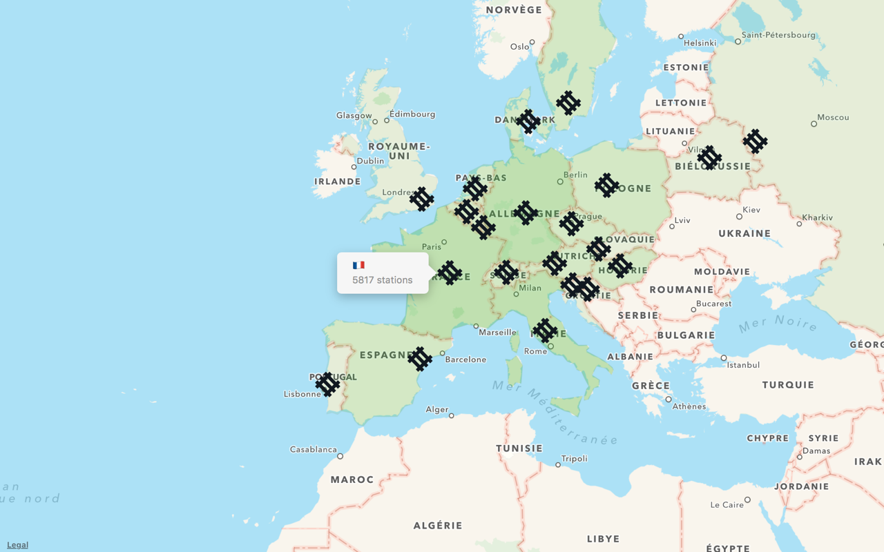
Each country is overlaid by a green layer (in MapKit, this is an MKOverlay). The opacity of the layer is relative to the number of stations in that country.
We don’t see individual items, but suddenly we’ve learned something new about our dataset from this highest-level view.
Let’s try something else, zoom in just a little bit, and display the station again:
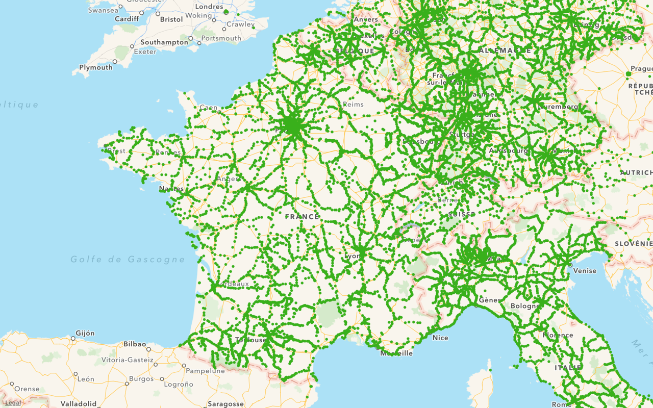
Each green dot is a train station.
This reveals the shape of the train network. This is something that we couldn’t see in the first visualization.
The dots are not interactive. They would be too small to be tapped and selected individually anyway, but this also helps performance. In fact, the dots are, once again, drawn as a single layer. In MapKit, this is done using an MKOverlay again, instead of full-fledged MKAnnotations.
Different zoom levels
A map view is actually a Zooming User Interface. In a ZUI, “folders” are simply zoomed into instead of being opened. POI groups are really the same thing as folders, and POIs are individual documents. When a “folder” is closed, you can’t see its contents, but you can have a preview.6
It’s the same with maps: when you zoom out, you can’t see individual features, but the big picture is revealed.
In our example, we have three levels of detail:
- Europe countries, or “Folders”
- Train network, or “Preview”
- Individual stations, or “Files”
And then it’s just a matter of switching the level of detail dynamically. We simply reveal more details as we zoom in:
That’s better
Of course, the naïve “Let’s dump thousands of POIs on the map” approach is easier at first. But when you run into performance issues, don’t just head to stackoverflow and pod install the first thing you find. Find what makes sense for your dataset, and display relevant, usable information at different scales.
–
The demo app I made for the screenshots in this post is available on Github.
-
The working title for this was POI Clustering considered harmful. The slides are over here. ↩
-
POI stands for Point of Interest: the location of “something” on a map.
It is also the meaning of the ⌘ symbol on your keyboard. ↩ -
MapKit isn’t to blame here.
MKMapViewcan handle thousands of POIs just right: it’s smart enought to filter out what’s not currently visible. The problem is to actually display so many translucent views. ↩ -
Most opensource libs use a quadtree-based algorithm which is faster, but less accurate than K-means clustering. ↩
-
Here’s a hint: there is no “Cluster” entity in our data model. ↩
-
Jef Raskin, one of the Macintosh’s fathers, later advocated Zooming UIs in The Humane Interface. ↩